Web design psychology or how colors, fonts, and markings influence your mood
Web design is something much bigger than just filling the website with a particular content and making it look nice. When a customer opens up your website, he feels different emotions from what he sees on a site and its organization. These same feelings—positive or negative—are totally in your hands; that’s why you shouldn’t underestimate content design.
It took ages to create knowledge that helps designers make effective graphics which reflect on users’ psychology. To get good results, you need to understand how design elements vary and how they should be used to influence visitors’ mood, attitude, and impression.
Now we’ll take a look at four components of web design which affect website users’ psychology the most. Using these tools, you will be able to create a site which will make your visitors come back to it again and again.
Content
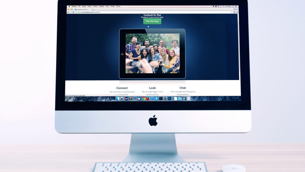
Content dictates the website design. Visitors come to your site to find necessary information and the design’s goal is to help them find that information quickly and easily.
When Internet was just introduced to our world, finding a 10,000-word article was a common deal. (Just for comparison, this article contains 1000 words.) It was very hard to find anything in those earlier articles, and least of all what was needed. As you can understand it caused a lot of negativity and anger.
Today, content should provide people with necessary information and at the same time not overload them. When a website is created considering this balance, users find information quickly and leave the website feeling content.
When you place the content inconveniently (providing too much information, not leaving enough free space, etc.), it annoys visitors and sometimes can even lead to your customer loss in business. Moreover, the type of the content you provide creates an image for you and your company.
Try to keep your content clean. Make it easy to read, brief, and professional so that your visitors will only have positive emotions and leave great feedback.
Space
The way your web page is organized directly affects how a person feels while searching your website. Content organization should be the primary aspect in every design project, but one should also pay attention to the sizing of the page. You probably know the term “white space” which is an area where there is no visual content. White space plays a huge role in a design generally, because it lets your visitors rest. Such “rest places” can usually be found at the edges of the screen or around some objects.
Minimalism is usage of as little visual content as possible but this content has to fully transmit your main idea. Nowadays minimalism is very popular.
To put it simply: if a visitor comes to your website and every centimeter of the space there is covered with some words, pictures, or blinking elements, than all of this together looks too chaotic and complicated. If you don’t have “white space,” their eyes will get tired very quickly and they will get stressed.
If you pay enough attention to organizing your content smartly, it will show your professionalism and will surely be appreciated by your visitors. All of the information on your web page should tell your visitors that you are easy and comfortable to work with. A simple website also shows that you care about your visitors and don’t want to waste their time.
Color
Often colors represent a new or existing style of the brand or organization. But how do these colors affect your visitors’ feelings?
Most examples of visual identity use neutral colors (shades of white, gray, and black), together with the brand’s main colors. In modern design-projects neutral colors often prevail, depending on the web space you have.
For example if an organization’s main colors are blue and yellow then they will probably choose a white background to show their content but surely not a yellow or blue one. These neutral colors create “white space” for visitors’ eyes.
The colors you use also play a psychological role in your design. Cold colors (shades of blue, green, purple) are often associated with pleasant feelings. But in contrast these colors can also lead to negative emotions. Warm colors (yellow, orange, red) are calming but can also result in negative feelings. White is considered a color of goodwill but is also a color of emptiness and dejection. Black is often associated with a high level of proficiency but it might seem too ordinary. You should be very careful and think of every little detail while designing a website because every shade matters.
Text design
Lastly, text design can also cause a whole ton of emotions and feelings. There are thousands of fonts and thanks to developing technologies, like CSS3, these fonts became available for websites.
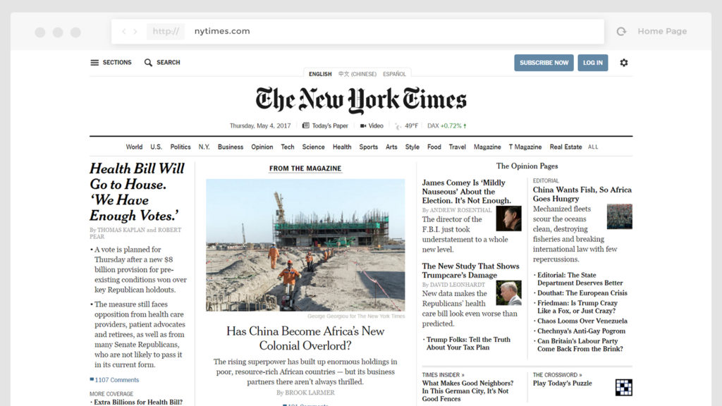
Different types of fonts are created for usage in different situations. Serif fonts are often related to professionalism and serious intentions while San-Serif fonts are a lot more modern and less official.
www.nytimes.com
For example, most news portals like The New York Times use them to appeal to such feelings as traditionalism and importance. They want you to feel their authority and to understand that what you read is very important and people know really well what they are talking about.
Sans-Serif fonts are used more and more often to show modernity, sophistication, and prestige. In technical areas, they add futurism and relevance.
Also, the placement of the text is very important. Distance between paragraphs and different elements, font size—you should pay attention to all of it. Large paragraphs are very hard to read and work with. If you make the font too big or too small it may seem that you scream at your visitors or whisper to them.
Conclusion
A web designer needs to be proficient in psychology to make his choices and understand which tools will help him reach the desired result and create the most effective content.