Gestalt Principles in UX Design
We are sure you’ve had moments when you were astonished to see some optical illusion. It’s amazing how our eyes can play tricks on us since we tend to believe what we see and our brains interpret the data. What do designers need to know about perception? Perception is a difficult thing and you are never able to control how a person perceives this or that information. The human brain is a wonderful “box” of data that hasn’t been explored fully and remains a mystery. The knowledge and base of cognitive mechanisms are highly necessary for UI/UX specialists.
How about Gestalt?
There is a common phrase in the design world: “Don’t make users think.”
Gestalt psychology looks at the human mind and behavior as a whole. This suggests we don’t simply focus on small components. People’s minds are able to perceive objects as part of a greater whole and as elements of more complex systems. In other words, our mind is always trying to make order out of chaos. Gestalt principles help to understand how people perceive visual elements when certain conditions apply.
In this article, we share some of these principles and how they can be applied to UX.
1. Principle of Proximity
This main goal of this principle is objects are perceived as a whole and related to each other. It helps designers make layouts in interfaces with lots of content. Of course, users don’t want to spend much time to understand how a complex interface works, and that’s why an intuitive screen has more chances to attract users’ attention and provide them with the great features.
One interesting example is the Pillow Cake logo. It contains different small figures which are laid out close to each other. It seems to people this cluster looks like a dog. Proximity is important for content in user interfaces, especially white space. The space without any symbols or content is used to organize its elements as groups, unities, and provides air to general layout.

2. Principle of Common Region
This one is similar to the principle of Proximity in a way. It’s used for organizing content, but doing so, it can address several different purposes: grouping or separating the information, or serving as a prime focus. It enhances the order, scannability and promotion of your content, as well as brings the most vital parts of your message to the forefront, emphasizing its importance. Thanks to the principle of Common Region, various elements belonging to different contextual groups can be united within larger informational stacks. This union can be attained by operating shapes, shadows, lines and colours.
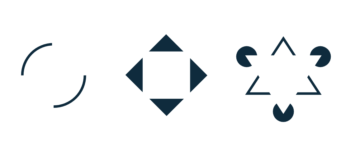
3. Principle of Closure
Our brain tends to see whole images, and that’s why, in some cases, people attempt to fill in the missing parts. The main goal of this principle is to see incomplete or partly covered figures. It helps designers reduce the number of elements needed to communicate information and make the design more attractive.
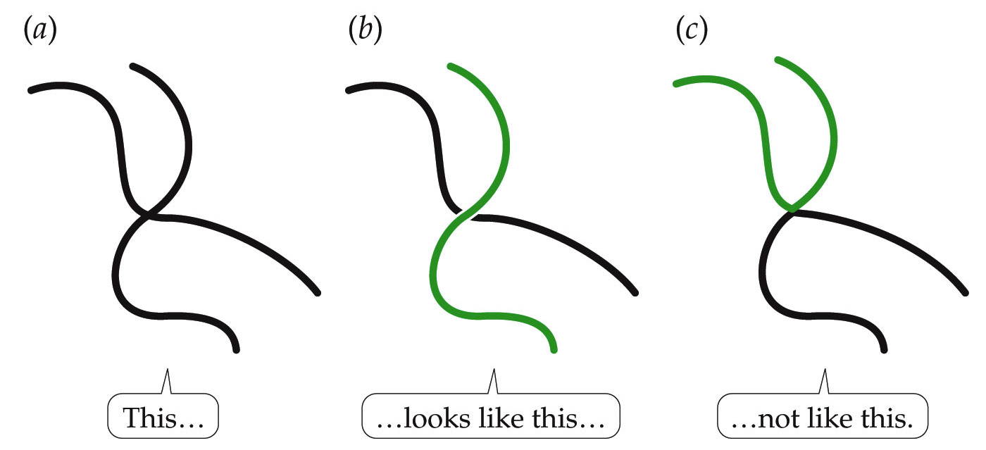
4. Principle of Good Continuation
The main idea of this is our eyes can easily find and follow items located along a line. Thanks to this, all items are perceived as a unit.
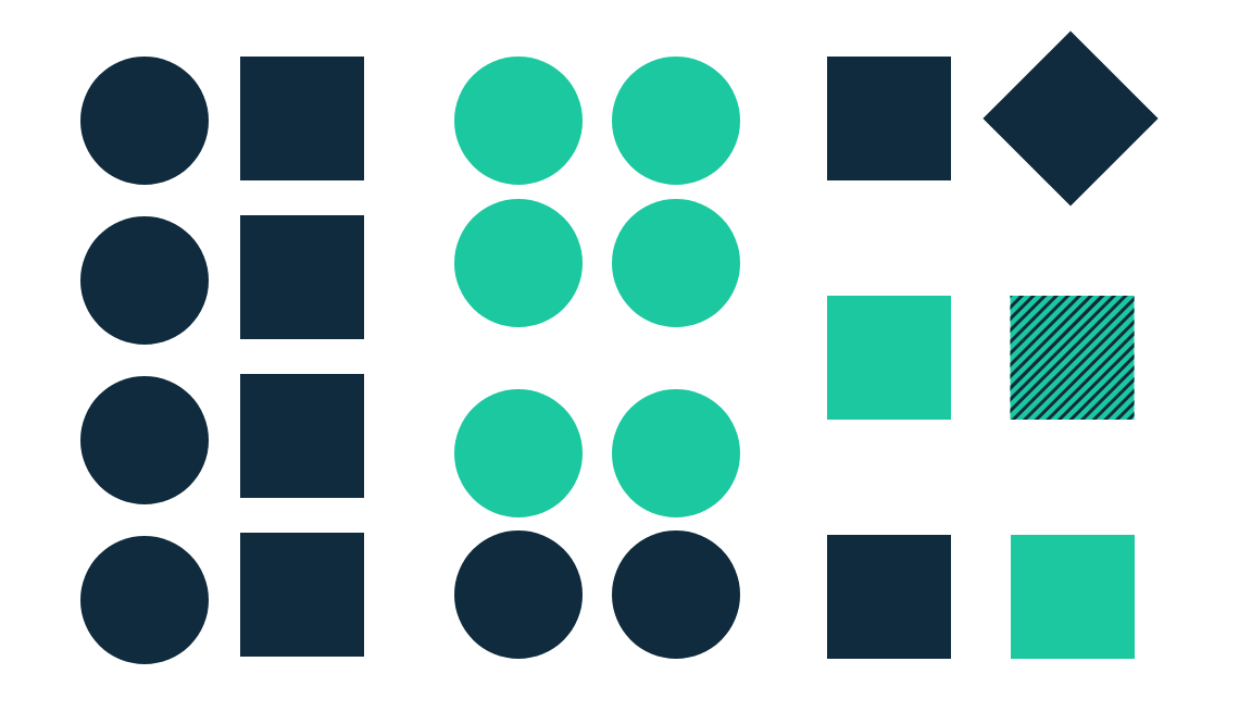
5. Principle of similarity
This includes objects of the same kind. This principle has great importance for design, as it appreciates the simplest and easiest ways of transmitting information. Having created two similar elements, the designer can explain the meaning of each of them.
In this way, visual nomenclature can greatly help identify elements belonging to one or other categories.
6. The Principle of Symmetry
Symmetrical items are usually recognized as united despite the distance between them, thus imparting order and steadiness to the promoted content. This principle uses simple, balanced and engaging elements combined with the perception of the order and steadiness conveyed by the visual content symmetry to help us find the harmony within the given design. This why Symmetry is an efficient way to promptly communicate the most important parts of your message.
Although Symmetry is mostly taken as rather good, it may feel a little tedious and overly still. Today symmetry trends are inclined to be more lively and fascinating. For this very reason, it can serve you well to add an asymmetrical spot to your symmetrical design. It accentuates and illuminates your design while making an impression. 7. The Principle of Common Fate
This principle relies upon the notion that elements leaning towards the same direction are usually taken as related. The similarity or distance, in this case, does not play any role, since the elements are united with the common visual ‘goal.’ It works without actual movement, if there are elements implying their supposed movement or direction.
The principle of Common Fate is more impressive with the majority of elements acting synchronically, moving in the same direction at the equal speed and in the same period of time. This principle is especially good for drawing attention to a specific end purpose presented by some highlighted visual element, or for presenting relations between certain content groups.
In conclusion, it should be emphasized the described principles of UX design are intended to help you understand the best existing ways of communicating your message to the general public. However, the first and the most important part of any UX design should be the user experience itself, not your message. You should always put the convenience, simplicity and overall usability to the forefront to provide an intangible experience any user would like to repeat.