Full update on Android emojis
We usually post articles about novelties in different programming languages or technical devices but we thought and we hope that you will like this article just as much as you like the ones mentioned above.
We live in a modern world and we all know what messengers are. We all use them and we all use emojis while using them.
You may probably know that Google has just redesigned over 2000 Android emojis.
In this article Rachel Been, Material Design’s art-director and graphic designer and Augustin Fonts, Google’s Product Manager will tell you everything about the difficulties that Google team faced in this process, and the new features and looks.
Since the day Android KitKat appeared, the quantity of emojis has grown to over 2,000 with only some small style changes. Soon, high-density screens became more affordable and the new era of messaging began. This made us think of a full Android-emojis’ modernization.
At Google I/O 2017, we announced the full transformation of Android emojis’ font which included the unification of visual style and a completely new design. We designed a product which cultivates cultural awareness through multinational and inclusive emoji.
Examples of new people-emoji
Transition to new emojis
The original style of our emojis was simple and flat, with bold color blotches. This design became Android’s calling card, which differentiates us from other platforms.
After many years, all of the categories were replenished with different emojis and the whole set became stylistically diverse. However, our design system wasn’t fit up with standards which would unite the look of all of the illustrations. As a result, the “new-look” emojis differed a lot from the “old” ones and it became hard to find the emoji you were looking for on a keyboard.
It was time for some changes.

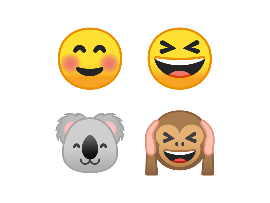
We designed a unified style for animals set.
![]()
New design system
We have looked at our past mistakes and made a decision that a strong design system had to become the main topic of the transformation. With its help and without extra efforts we wanted to create a recognizable emoji-style. In addition to a unified look we wanted the system to help us remain consistent in the process of releasing new emojis.
After choosing the shape, grid, representation, and color, we had a chance to make the set look alike while keeping its expressiveness and character. By implementing a strong design system we got rid of the main barrier. Since then all of the emojis have been drawn by different artists, but the icons remain consistent clear and understandable.
Shape
Yes, we did! We said “bye” to blobs. We changed the asymmetric and little dimensional shape of the emoji to a circle that can be easily scanned. We relied on bold color, purposeful asymmetry, and sharp facial features to transmit the emotions.
Our team has been working hard to make sure that the emotional sequence is kept in the right order. One of the most important reasons for redesigning was to avoid confusion or misunderstanding between platforms. We wanted to make our user feel reassured that an emoji he sends to a friend will be delivered, no matter which platform his friend uses.
System of a grid
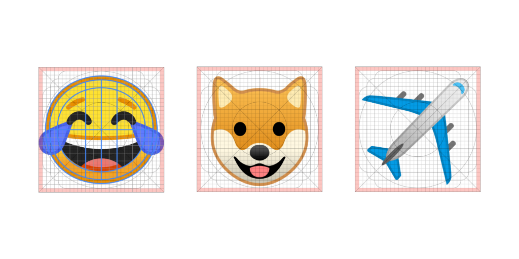
Emojis are designed on the same grid to provide maximal readability and consistency.
To make emojis readable and consistent, we built them on the same grid. We used a modified version of the Material Design product icon grid. When making illustrations, we did not obey the rules as much as we do in iconography. We capitalized on the grid in three particular ways:
- Unified scale and size in all illustrations.
- Building a consistent set of shapes in the whole set.
- Facilitating designers aligning various parts of emoji in the correct places (think specific areas for eyes and mouths).
We also changed the scale and angles of smiles to make them as simple as possible.
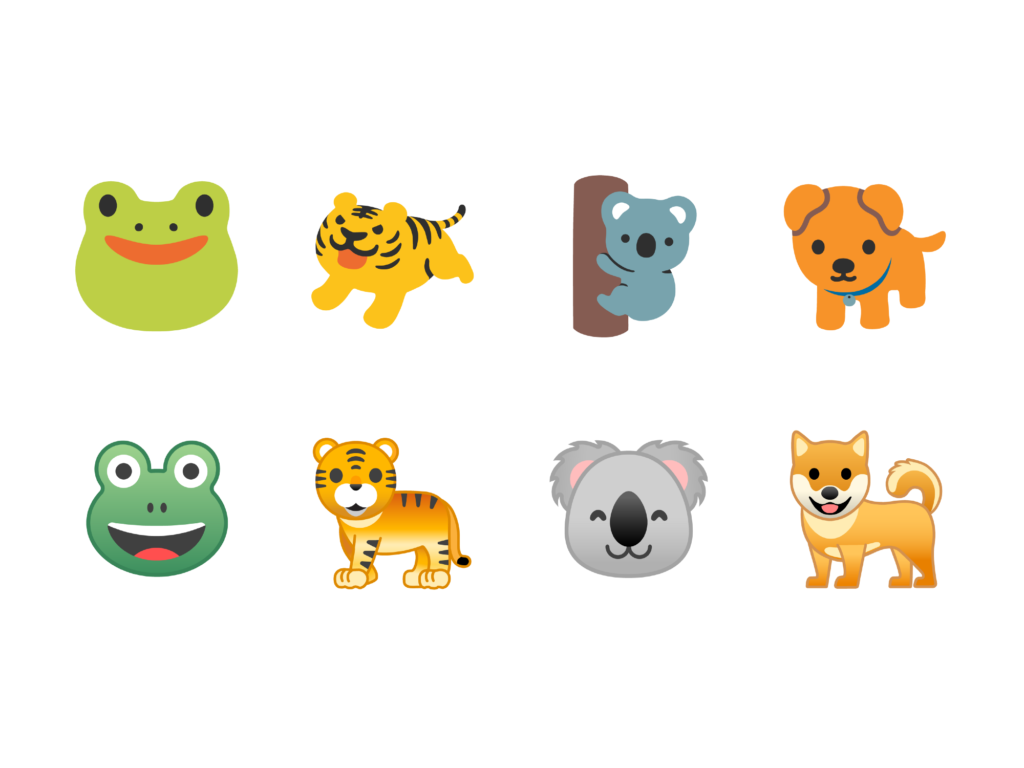
We used the grid to create angle and scale standards. In Android N (top row), the animals’ postures, angles, and styles were inconsistent.
Reusable components
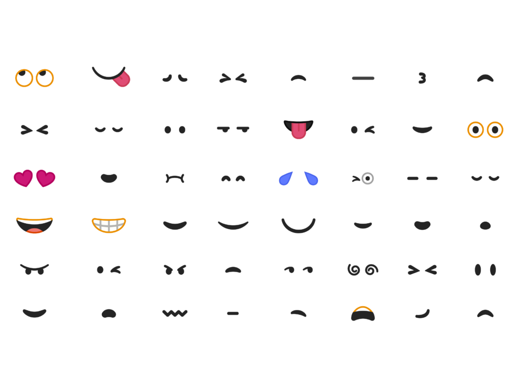
We designed a big set of reusable components which express feelings.
In addition to the grid, we designed a new set of reusable elements for certain emoji-categories. Firstly, they maintain the same style and readability in all grids. Secondly, they help to define unique features of our illustrative manner and make it easier to create new emojis. One of the most interesting part was to mix components from different categories. As a result of this work, you can now find quite emotional animals.
We used many elements, such as eyes and mouths for both: smiles and animals.
Color
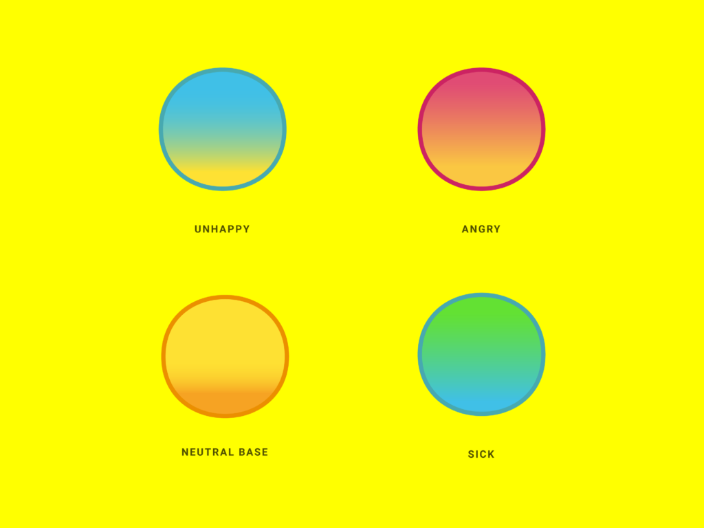
Colors strengthen the emotions.
After renewing the color scheme we received a fresh and consistent palette of bright colors. We created color-sets for different categories. You can see this in the “emotional smiles” set—red, blue, yellow, and green shades are now related to specific emotions.
Relying on Material Design products, we introduced a new bright style where emojis became more tactile. This let our team experiment with colors. Gradients made smiles more clear.
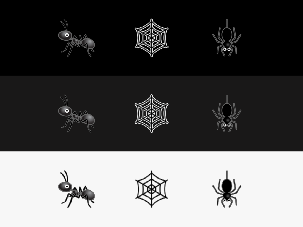
Using gradients and tonal strokes makes emojis easier to read on any background.
Another way to make emojis easier to read is to add tonal strokes. We selected the color of the line according to the emojis-palette of a certain category. For categories that consisted of many different colors we added a dark, semi-transparent stroke. In simpler categories such as animals, people, or expression emojis we used two main colors and a stroke based on the secondary color of the emoji.
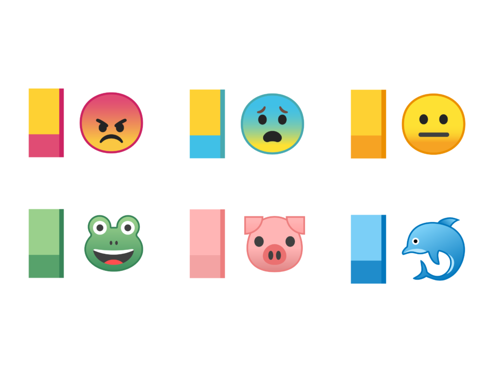
The new color system unites all of the emojis in every separate set.
We agreed that our emojis look really stunning. Apart from this, the tonal stroke makes them easy to read on any keyboard and in any messenger, regardless of the background they appear on.
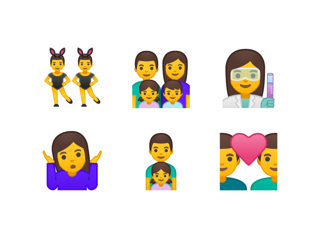
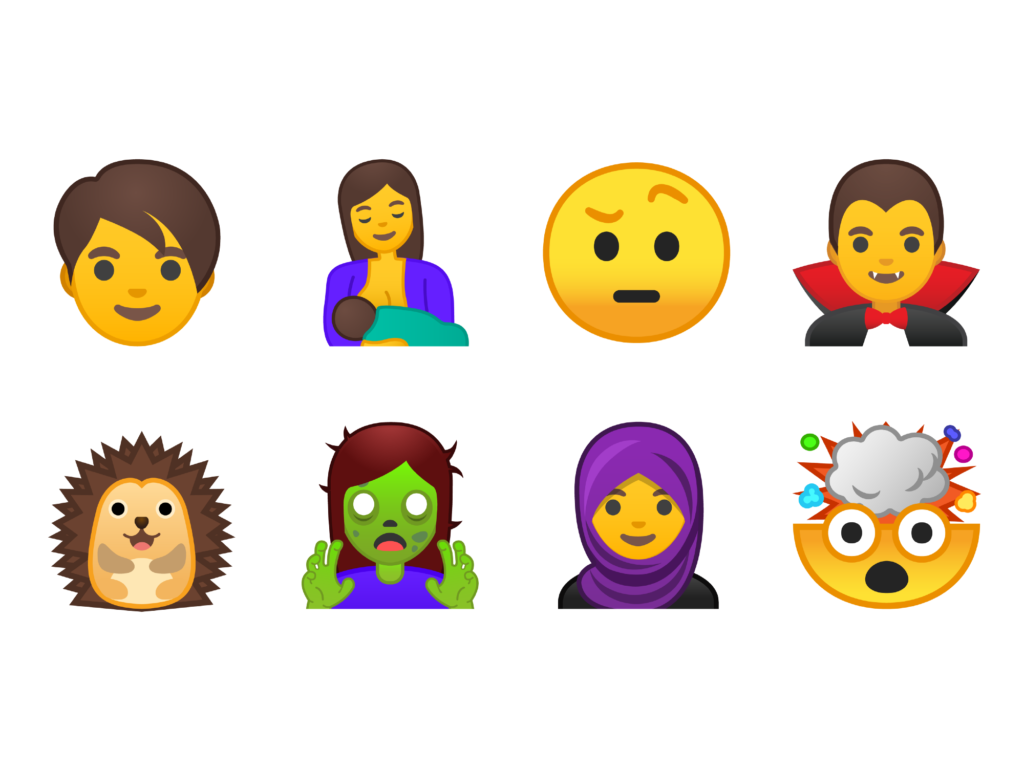
69 new emojis
While redesigning Android O we designed 69 new emojis, which are part of Unicode 10. In this set you will find new, more natural-looking emojis, such as a woman in a hijab, a mother who is breastfeeding, and others.
Set of 69 new emojis.
There are also nine new emojis, which will let users broaden their range of emojis. Fans of fantasy, animal-, and food-lovers—everyone will find something they love: from disgusting green zombies to ferocious T-Rex and appetizing dumplings.
We have come a long way since the time when Android began to support color emojis. And today we are taking the biggest step! We hope you will like using these new emojis just as much as we liked designing them.
You can read the original article here.